
Moped Rich is a personal project turned proof of concept, showing how strategic design, content, and SEO can build real traction without paid ads.
MopedRich.com is a full branding and digital marketing project created to serve an underserved corner of automotive culture: vintage mopeds. This project covers logo design, website design, content creation, optimization, merchandising, and brand growth.
It began as a personal project. It became proof that strong branding, thoughtful design, and smart content strategy can build real traction.
MopedRich was built as a real-world experiment. I treated it like a client project from day one. The goal was simple but ambitious: build a respected automotive blog that ranks well and supports a loyal community.
Before MopedRich, vintage moped culture had a visibility problem.
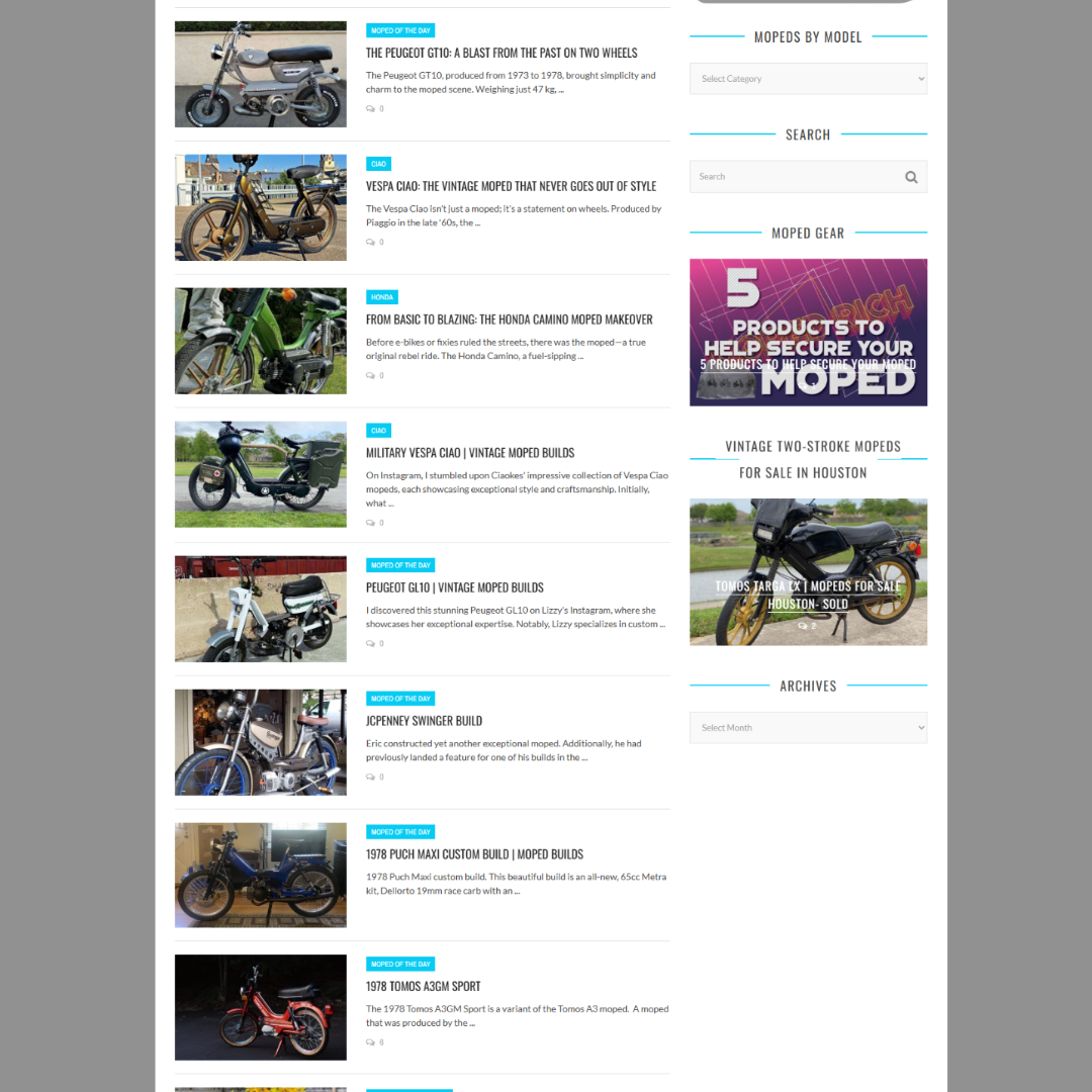
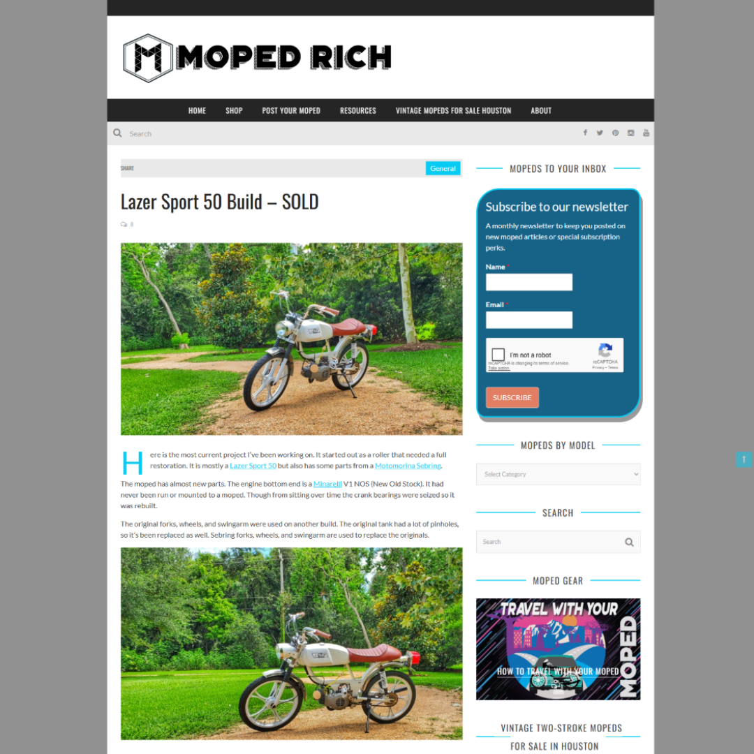
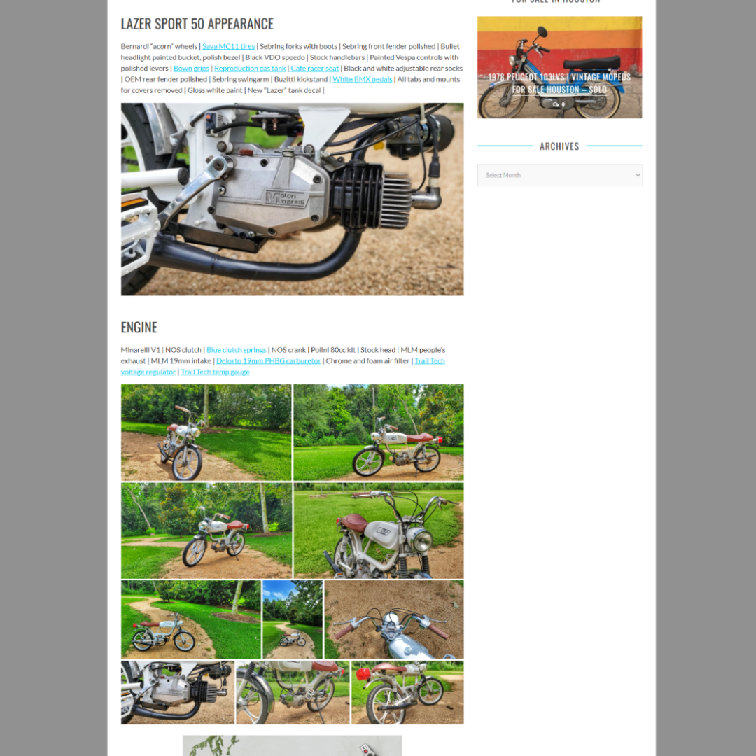
There were websites that showed moped builds, but they lacked context. Most featured a few photos, little to no description, and no storytelling. Many focused on only one or two keywords. Builders were creating amazing machines, but there was no dedicated place that truly documented the builds or the culture behind them.
This niche was clearly underserved.
There was an opportunity to:
The primary goal was to build an automotive brand and blog that could rank in search and grow a real fanbase.
Secondary goals included:
This was never about quick wins. It was about building something that could last.

I handled nearly every part of this project myself:
A close friend assisted with some SEO strategy and planning, but execution was handled solo. Working alone allowed for faster decisions and a shorter launch timeline.
The content strategy focused on medium and long-tail keywords. Instead of chasing only the most competitive terms, I aimed to build authority through volume and relevance.
The process looked like this:
Over time, this approach worked. All traffic came from organic search or social shares. One of the biggest wins was ranking number one for the main keyword in the niche, outperforming larger and older sites.
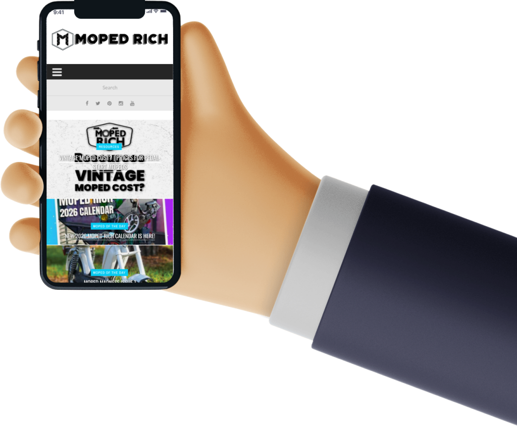
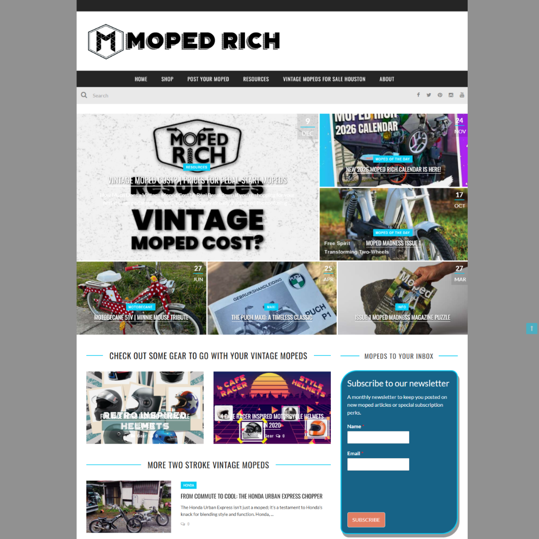
The visual style of MopedRich is modern, minimal, and editorial.
The brand uses:
The logo began as modern and minimal. Over time, it evolved to blend modern design with subtle vintage influence, reflecting the culture it represents.
The site layout was inspired by social media feeds. Users scroll through builds, discover content naturally, and explore without friction.
Navigation was intentionally kept simple. No clutter. No distractions.
Key UX decisions included:
A major focus was on maintaining a high Flesch Reading Score, making the content easy to read for beginners and experienced riders alike.
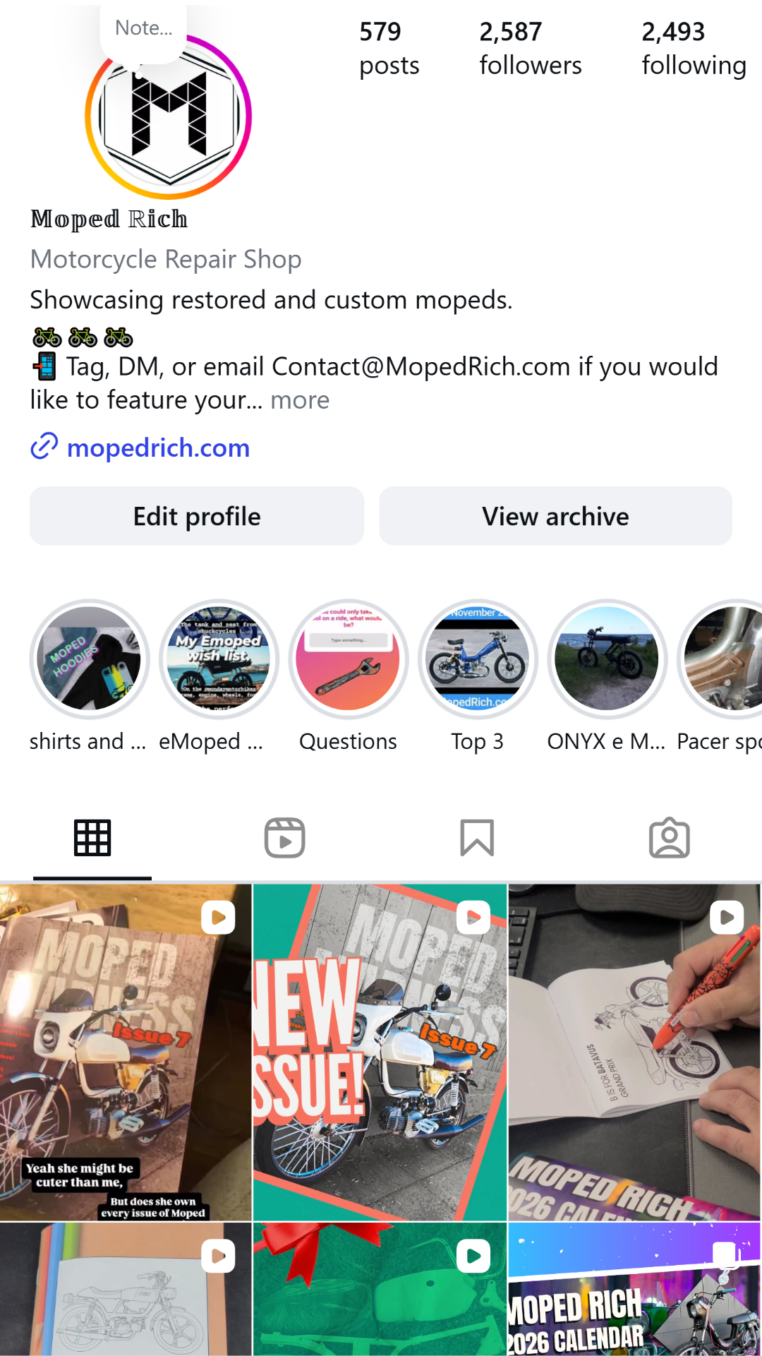
The community response validated the project.
Builders began submitting their own mopeds. Followers engaged across social platforms. Visitors returned for inspiration, information, and conversation.
MopedRich became more than a website. It became a shared space for people who care about keeping moped culture alive.
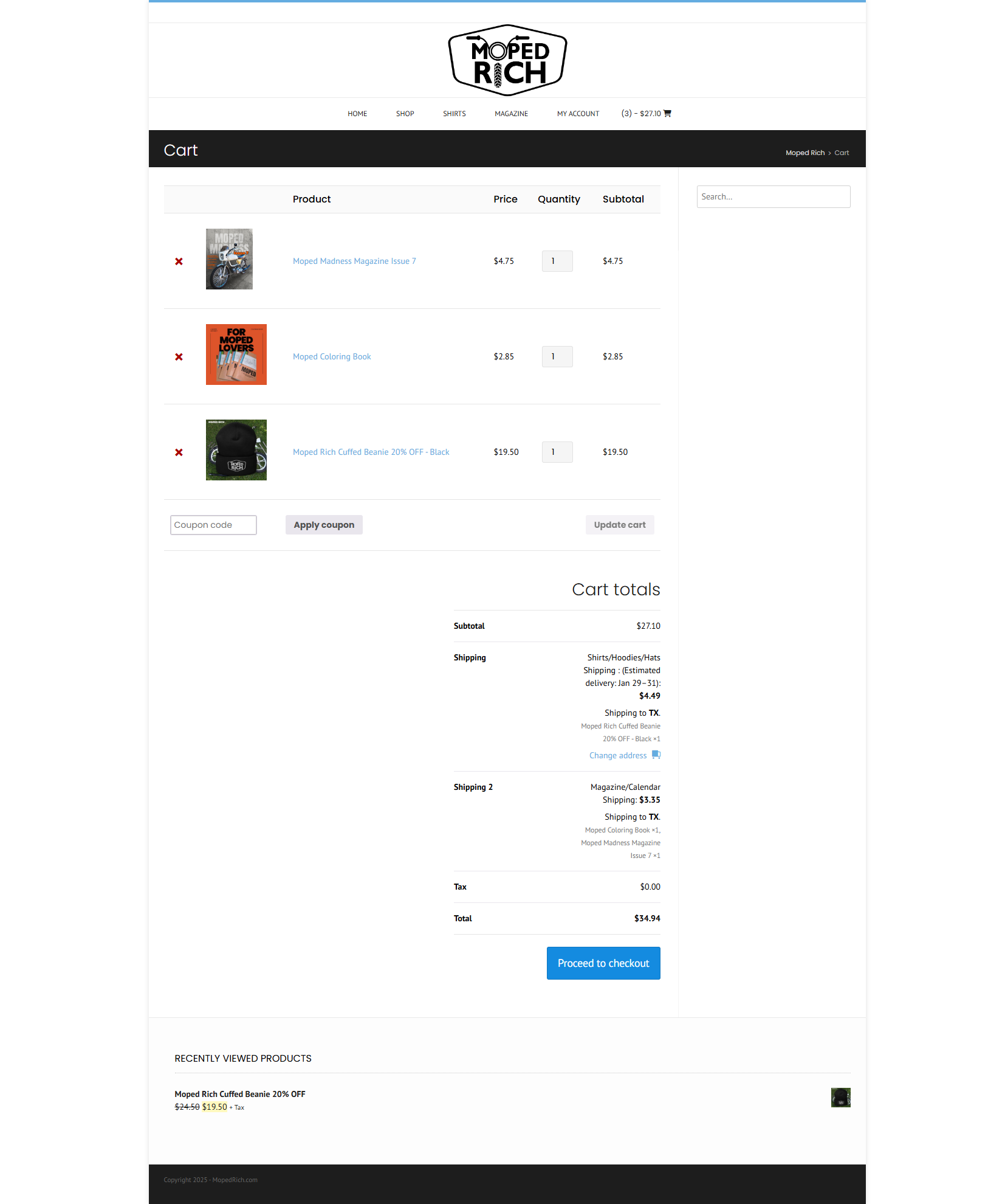
Merchandise was part of the original plan.
Once the site and social channels gained traction, an e-commerce store was introduced. While most visitors came for content, merch sales confirmed that the brand resonated beyond the screen.
The brand felt like the community — not a company selling to it.
More importantly, the project proved something personal.
This was a proof of concept.
It showed that when design, content, and marketing are aligned, they work. It gave me confidence in my skills and confirmed that this is more than a passion — it’s a career path.
MopedRich is still evolving. Like the culture it represents, it grows slowly and authentically.
This project represents how I approach client work today: clear strategy, strong design, real content, and long-term thinking.