
Horizon TV Mounting is a local startup that needed a professional brand, a modern website, and a simple way for customers to book services online. The goal was to launch with credibility, reduce friction for customers, and automate as much of the booking and communication process as possible.
Horizon TV Mounting is a local consumer electronics installation business offering TV mounting and related services. As a startup, the business launched without a logo, website, or online presence. My role was to build the foundation of the brand and provide the tools needed to start booking jobs immediately.
This was a full-scope project that included logo design, website design and development, content creation, online booking and quote tools, business email setup, and print materials such as business cards and flyers.
At the start of the project, Horizon TV Mounting had no branding or digital footprint. In a market where trust is critical, this presented a challenge. Customers are often hesitant to book in-home services without first feeling confident in the business they are hiring.
Many similar businesses in this space rely heavily on social media pages alone. While social platforms are useful, they often fall short when customers want detailed information, clear service descriptions, or an easy way to book services without back-and-forth communication.
Without a professional brand and website, the business risked:
The client’s primary concerns were clearly communicating services, appearing professional from day one, and giving customers an easy way to generate quotes and book installations on their own.
Success for this project meant launching with a polished, professional presence that worked across both digital and print.
The primary goals were:
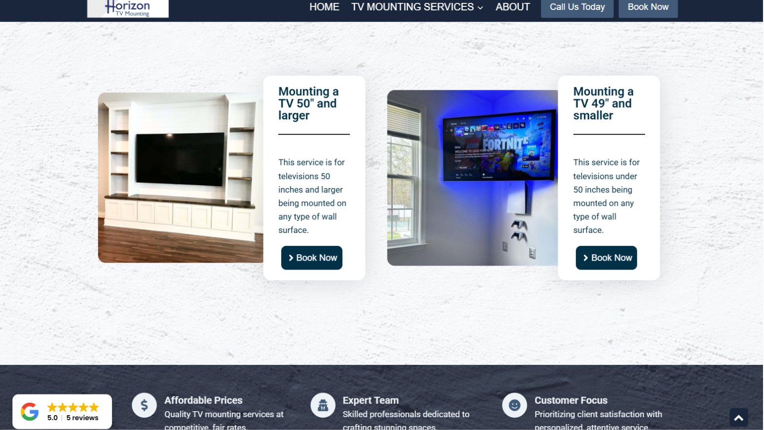
The main conversion action was simple: book an installation.
To support this goal, the site needed to be easy to read, easy to navigate, and focused on answering customer questions quickly
I handled all aspects of the project, including layout, visual design, website functionality, and content creation.
Before designing, I reviewed competitor websites and approached the project from a customer’s perspective. I focused on what information customers would look for, what might cause hesitation, and what features would make booking feel simple and trustworthy.
The logo was designed to be versatile. It needed to work just as well on a website as it would on a business card, flyer, work shirt, or vehicle signage.
My IT background played an important role in this project. I handled hosting configuration, business email setup, mobile email integration, and troubleshooting, allowing the client to focus on launching the business rather than dealing with technical issues.
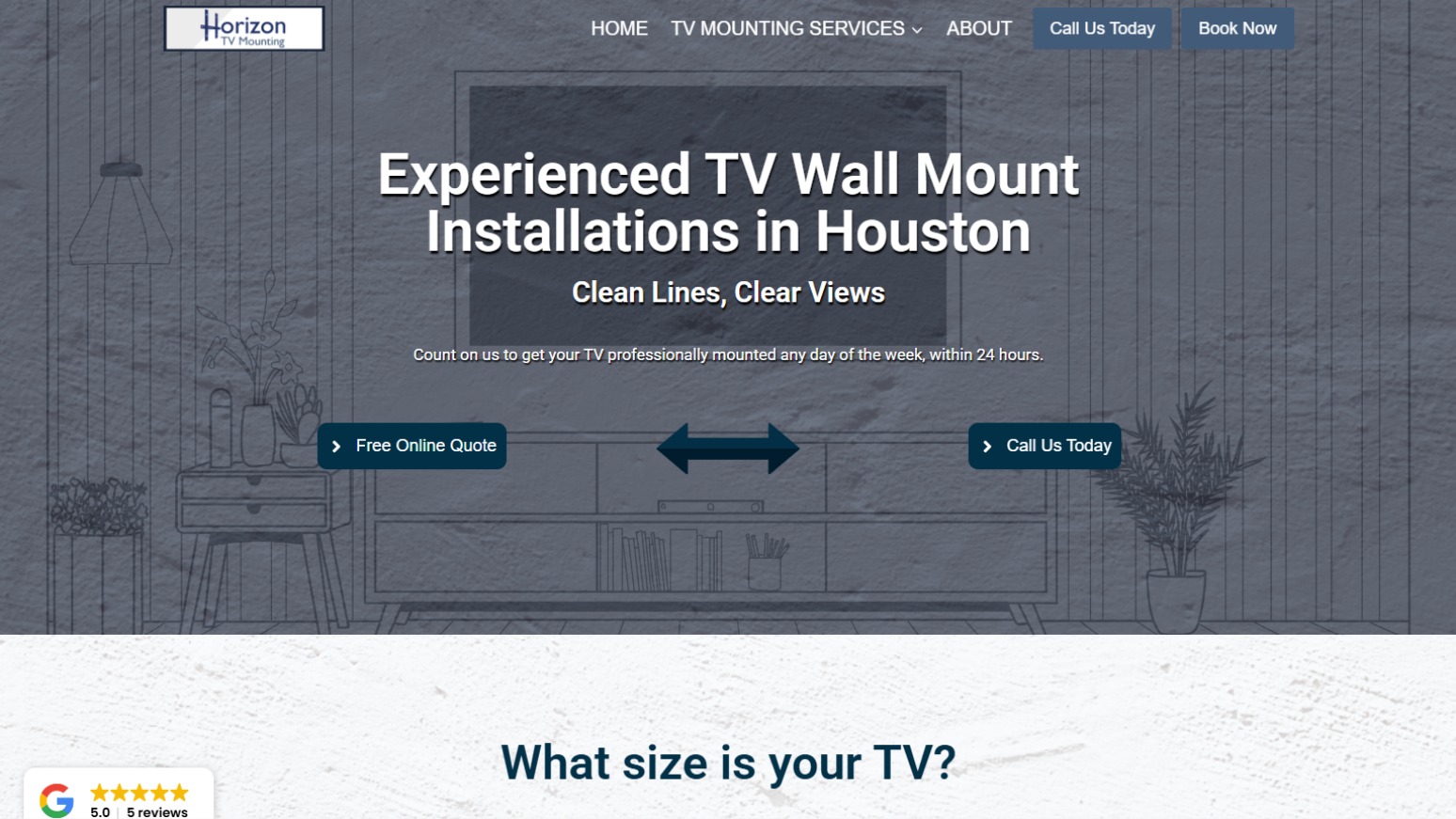
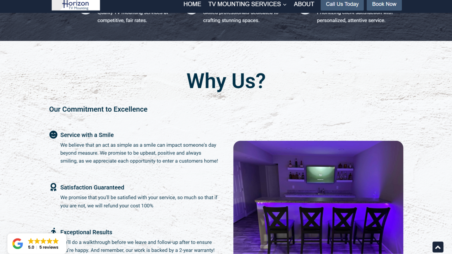
The visual style for Horizon TV Mounting was clean, professional, and easy to understand. Readability and clarity were prioritized over decorative effects.
The logo was designed with real-world use in mind. I considered how it would look on signage, uniforms, and work vehicles, not just on a screen.
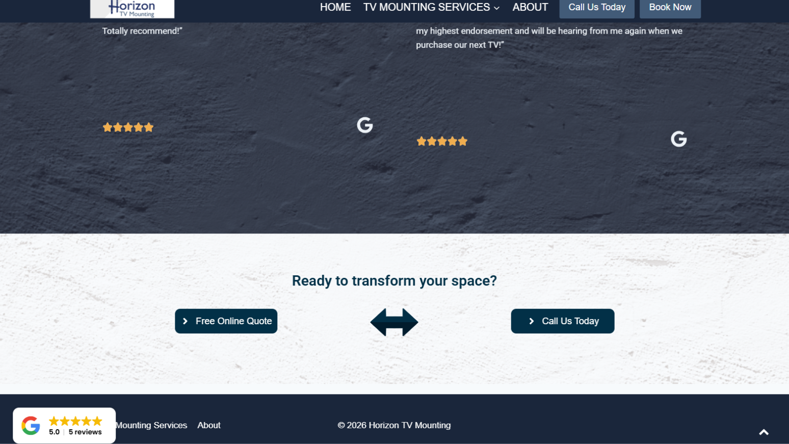
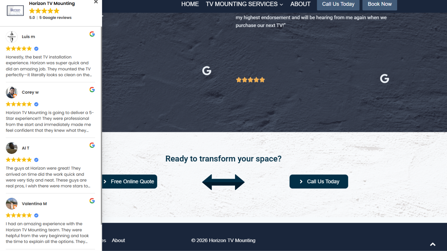
The website layout was broken into clear sections, each supported by visuals that reinforced the message. Navigation was kept simple and accessible from anywhere on the site.
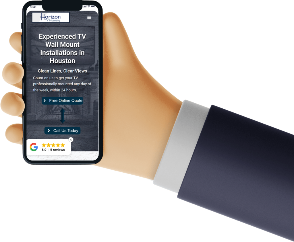
User experience was a major focus. Call-to-action buttons were clearly labeled, consistently placed, and designed to work across desktop, tablet, and mobile devices. The booking flow was kept short, with minimal steps, while still allowing enough detail to generate accurate quotes.
After designing for desktop, each page was tested on mobile devices and adjusted as needed to ensure a smooth experience for mobile users.
The project delivered immediate value by giving the business a professional launch and the ability to take bookings right away.
The branding and website helped reinforce customer trust and positioned the business as credible and professional from day one.
The booking and quote system reduced workload by automating much of the scheduling and communication process. The client can manage jobs through the booking tool and generate quotes internally when needed.
This project also demonstrated my ability to handle a wide range of responsibilities, from branding and layout to technical integration and automation.